• Welcome to The Tolkien Forum! Connect with fellow Tolkien enthusiasts and join a community that is over two decades old, and still going strong. We look forward to meeting you.  Register

What Art Project Are You Working On Right Now?

Some updates!

First of all, color relativity is WILD.
1000001065.jpg

I used the exact same skin tone base color for both of them, yet Maedhros looks distinctively paler, right? COLOR RELATIVITY. I decided to give Snottington pale hair and clothes, because if he had black hair, he would look paler than Maedhros, which would add confusion. So because Maedhros' hair and clothes are dark, he looks chalky white relative to Snottington, whose hair and clothes are harmonious colors with his skin.

And after more coloring and shading:
1000001066.jpg

Normally when I color Maedhros, I use peachy pinks and warm purples for his warm-toned complexion. Here, I used an ashy brown, and occasionally some red (mostly around the eyes) and no blush whatsoever. This looks especially stark against the warm torchlight.

Meanwhile, I shaded Snottington with cool purplish pinks, once again harmonious with his coloring. Also, he accidentally has some glowy highlighter worthy of 2016 Instagram girls! 😂 I'll probably tone it down a bit, but I was trying to show the torchlight reflecting on his skin. Again just trying to show that he has some healthy color and Maedhros... does not.

(But even while poisoned, Maedhros would likely still be able to easily take him in a fight.)

I hope the colors are communicating what I want them to-- let me know if you think they are or not!

This is almost done already, so the next time I give an update on this, it will likely be in its own Glittering Caves post.
 
Some updates!

First of all, color relativity is WILD.
View attachment 40488
I used the exact same skin tone base color for both of them, yet Maedhros looks distinctively paler, right? COLOR RELATIVITY. I decided to give Snottington pale hair and clothes, because if he had black hair, he would look paler than Maedhros, which would add confusion. So because Maedhros' hair and clothes are dark, he looks chalky white relative to Snottington, whose hair and clothes are harmonious colors with his skin.

And after more coloring and shading:
View attachment 40489
Normally when I color Maedhros, I use peachy pinks and warm purples for his warm-toned complexion. Here, I used an ashy brown, and occasionally some red (mostly around the eyes) and no blush whatsoever. This looks especially stark against the warm torchlight.

Meanwhile, I shaded Snottington with cool purplish pinks, once again harmonious with his coloring. Also, he accidentally has some glowy highlighter worthy of 2016 Instagram girls! 😂 I'll probably tone it down a bit, but I was trying to show the torchlight reflecting on his skin. Again just trying to show that he has some healthy color and Maedhros... does not.

(But even while poisoned, Maedhros would likely still be able to easily take him in a fight.)

I hope the colors are communicating what I want them to-- let me know if you think they are or not!

This is almost done already, so the next time I give an update on this, it will likely be in its own Glittering Caves post.
Dang I missed a lot when I was away! 😭
 
Some updates!

First of all, color relativity is WILD.
View attachment 40488
I used the exact same skin tone base color for both of them, yet Maedhros looks distinctively paler, right? COLOR RELATIVITY. I decided to give Snottington pale hair and clothes, because if he had black hair, he would look paler than Maedhros, which would add confusion. So because Maedhros' hair and clothes are dark, he looks chalky white relative to Snottington, whose hair and clothes are harmonious colors with his skin.

And after more coloring and shading:
View attachment 40489
Normally when I color Maedhros, I use peachy pinks and warm purples for his warm-toned complexion. Here, I used an ashy brown, and occasionally some red (mostly around the eyes) and no blush whatsoever. This looks especially stark against the warm torchlight.

Meanwhile, I shaded Snottington with cool purplish pinks, once again harmonious with his coloring. Also, he accidentally has some glowy highlighter worthy of 2016 Instagram girls! 😂 I'll probably tone it down a bit, but I was trying to show the torchlight reflecting on his skin. Again just trying to show that he has some healthy color and Maedhros... does not.

(But even while poisoned, Maedhros would likely still be able to easily take him in a fight.)

I hope the colors are communicating what I want them to-- let me know if you think they are or not!

This is almost done already, so the next time I give an update on this, it will likely be in its own Glittering Caves post.
A little late on seeing this update, my apologies 🫡

It's coming out lovely!! I can definitely tell that Mae is meant to be pale and bit ashen-faced, whereas Snottington has a healthier complexation. I think making him blonde was a great choice, he reminds me a bit of Lucious from Harry Potter, who I think has a similar personality 🤣
The torchlight glow on his face and clothes looks pretty cool, though.
I agree! It doesn't look like too much to me, it looks really atmospheric.
 
It's coming out lovely!! I can definitely tell that Mae is meant to be pale and bit ashen-faced, whereas Snottington has a healthier complexation.
Oh good, thank you!

It's ironic, I realize, because the name "Snottington" doesn't exactly evoke a mental picture of healthy color and glow, whereas Maedhros in this period is supposed to be full of the "fire of life." But, that's the point, I guess. Everything is backwards and not how it's supposed to be, thanks to this assassination plot.

I think making him blonde was a great choice, he reminds me a bit of Lucious from Harry Potter, who I think has a similar personality 🤣
Hehe, thanks! I initially imagined him with slick black hair, but made him blond for the purposes of color relativity in this picture. But now I'm very glad of it, because I think the blond makes him look that much more Prissy and Snotty. He also looks like he could be related to Thingol or Thranduil, both of which are widely thought of as rather proud Elven kings.

I agree! It doesn't look like too much to me, it looks really atmospheric.
It might be a screen difference, then. It looks more toned down on my laptop screen, and much brighter on my tablet and phone. Have any of you guys noticed any differences on your different device screens?
 
Hehe, thanks! I initially imagined him with slick black hair, but made him blond for the purposes of color relativity in this picture. But now I'm very glad of it, because I think the blond makes him look that much more Prissy and Snotty. He also looks like he could be related to Thingol or Thranduil, both of which are widely thought of as rather proud Elven kings.
Yes, he does remind me of Thingol and Thranduil as well! Not to mention I think because so many canon characters have black hair, it'd be easy to confuse him with someone else if he had darker hair (perhaps Feanor or Caranthir in a particularly arrogant moment).
It might be a screen difference, then. It looks more toned down on my laptop screen, and much brighter on my tablet and phone. Have any of you guys noticed any differences on your different device screens?
I'll admit, I do almost everything from my singular laptop, so I may just not experience it because I don't use multiple screens to begin with. That said, I have heard of the issue from others, especially with making digital art.
 
It might be a screen difference, then. It looks more toned down on my laptop screen, and much brighter on my tablet and phone. Have any of you guys noticed any differences on your different device screens?
If it were me, I'd go by how it looks on the most 'toned down' screen. Personally, I don't mind things being bright and saturated, as I think it gives more life to a picture. Whereas things looking dulled down, flat or greyish... I don't like the look of that at all.

Colours always show up very brightly in my digital art app (krita), but after exporting the image to a JPG or PNG file (on the same device!), the colours are always less bright. So if something looks too bright while I'm drawing it, I won't change the colour immediately. First, I'll export it and see if it still looks too bright as an ordinary image file.
 
If it were me, I'd go by how it looks on the most 'toned down' screen. Personally, I don't mind things being bright and saturated, as I think it gives more life to a picture. Whereas things looking dulled down, flat or greyish... I don't like the look of that at all.

Colours always show up very brightly in my digital art app (krita), but after exporting the image to a JPG or PNG file (on the same device!), the colours are always less bright. So if something looks too bright while I'm drawing it, I won't change the colour immediately. First, I'll export it and see if it still looks too bright as an ordinary image file.
Good points!

In this case, the pictures I uploaded to TTF are screenshots, so hopefully there wasn't as much distortion as there tends to be when I export a PNG from ibisPaint. The color does seem more accurate in general this way, at least.
 
In this case, the pictures I uploaded to TTF are screenshots, so hopefully there wasn't as much distortion as there tends to be when I export a PNG from ibisPaint. The color does seem more accurate in general this way, at least.
The TTF upload thing is a different issue. If the image file size is too large, I think it gets automatically compressed when uploaded to the forum, which removes some of the colour. Screenshots are generally not a large file size, so the colour removal doesn't happen.
 
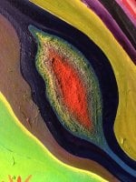
I've been using soft pastels and makeup brushes as tools and mediums for my drawing for a few months now, and I can confidantally say they're my favorites. Every stroke, shadow or coloring look perfect and in place when I use them. It definitely took me some time to find the perfect technique and the perfect paper to apply it on, but it's been worth the struggles.
 
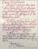
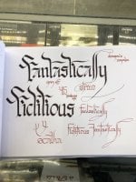
I myself am working always on art in multiple forms. I usually stick to painting, drawing, and calligraphy. I tend to paint on the more abstract side, my drawings usually trickle down to, "Cartoonish," and my calligraphy is used for graphic design work. I also use blended forms of calligraphy and illustration for my graphic design work for the various companies I design for. Here are some snippets of small things so you can get a general idea. "Fantastically Fictitious," is a project in its grassroot stages of a written and hand drawn zine of sorts incorporating my medieval style works. I.E Dragons, swords, wizards.
IMG_6770.jpeg
 

Attachments

  • IMG_7250.jpeg
    IMG_7250.jpeg
    335.3 KB · Views: 37
  • E4FEB3FA-73A7-4384-8C63-6EEC18A24A44.jpeg
    E4FEB3FA-73A7-4384-8C63-6EEC18A24A44.jpeg
    330.9 KB · Views: 39
  • 77353747889__D6054617-9FC3-47DF-A36F-E815A5C270E9.jpeg
    77353747889__D6054617-9FC3-47DF-A36F-E815A5C270E9.jpeg
    250.4 KB · Views: 41
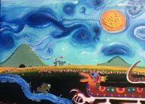
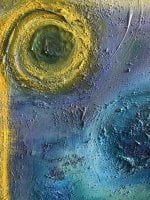
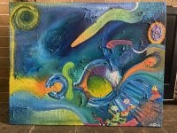
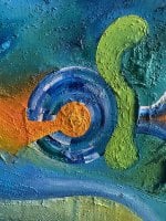
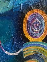
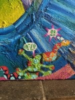
This one’s for the artists out there, kinda been reworking this painting I had that is semi large (24x36 ish). Just want some feedback on if it’s too busy or something that could potentially be scrapped or added. The painting is I would say about a snake with a man in his belly, ultimately trying to reach the hatching egg up on the pink cliff on the bottom left. The background is sort of an ethereal spiritual realm, and the orangish greenish spike is a comet above head. Probably going to add some more distinguished subject matter but don’t want the whole thing to get too busy.
 

Attachments

  • 02856BF6-DBD1-4290-AB55-05D78EE892B7.jpeg
    02856BF6-DBD1-4290-AB55-05D78EE892B7.jpeg
    599 KB · Views: 45
  • 25A61587-E0AB-4EE5-B017-E0B7C7083121.jpeg
    25A61587-E0AB-4EE5-B017-E0B7C7083121.jpeg
    626.2 KB · Views: 50
  • 01435612-A3B9-4E8D-A092-40CB0FA6719B.jpeg
    01435612-A3B9-4E8D-A092-40CB0FA6719B.jpeg
    587.4 KB · Views: 34
  • 79A6E978-6904-4916-B042-0BE7407A6FCB.jpeg
    79A6E978-6904-4916-B042-0BE7407A6FCB.jpeg
    471 KB · Views: 45
  • C81224A1-E3B8-40D4-AE44-FB98D0420B21.jpeg
    C81224A1-E3B8-40D4-AE44-FB98D0420B21.jpeg
    619.8 KB · Views: 35
This one’s for the artists out there, kinda been reworking this painting I had that is semi large (24x36 ish). Just want some feedback on if it’s too busy or something that could potentially be scrapped or added. The painting is I would say about a snake with a man in his belly, ultimately trying to reach the hatching egg up on the pink cliff on the bottom left. The background is sort of an ethereal spiritual realm, and the orangish greenish spike is a comet above head. Probably going to add some more distinguished subject matter but don’t want the whole thing to get too busy.
Personally, I think it looks fine as it is. How you want to change it is up to you, and I agree that it is best to not let it become too 'busy'.
One thing I might suggest: if you make new additions to the painting, make sure they do not draw the eye away or distract from what you want the main focus of the painting to be.
 

Today's events

Similar threads

Back
Top