• Welcome to The Tolkien Forum! Connect with fellow Tolkien enthusiasts and join a community that is over two decades old, and still going strong. We look forward to meeting you.  Register

Competition: Create our forum's next favicon

the Eye of Sauron to be a symbol for our friendly little community?
yes, i had the same question of myself. personally I don't.

Yet.... if the objective is to get 'click-through' to our site, there is a certain degree to which we must appeal to what is known, and what people are passionate about.

And there is no doubt the villains of the world receive far more 'recall and notoriety' than the heroes, by and large. (Note the great appean of the Disney villains.)

And, I'd guess if you stuck Sauron's eye up alongside Aragorn's Anduril, far more people would gravitate to the eye than the sword.

The same is true of Sauron and his eye, and Gandalf and his staff...or ring...though this is a little less clear.

The question becomes 'what is pervasive, easily recognized, and inviting to someone to click on.'

Mankind gravitates to evil and negativity. He far less frequently graviates to good and positivity.
"Them's jest the facts man"....

So while I agree, I offer what is, frankly, a larger dollar bill for consideration as well...only palatable to and justifiable by meself because it, too, is a large part of Tolkien's Middle-earth.


p.s. - as one other 'example', why is it, do we think, the more 'nasty' of the elves seem to get so much discussion and air time than the more regular 'good' elves do, overall? In this and literally thousands of other arenas, look around the internet, media, news and political world and see the focus of attention. it is quite revealing.
 
Last edited:
Alright, I'm submitting something! I am open to suggestions for improving it if anyone has any.
TTF Ring Icon.png

1704229765472.png


I could make the TTF letters darker and see if that helps. I can see it's a little hard to read when shrunken down. I can add a solid background too if necessary.
 
Nice!

How would it look if the "blue ring" and the T are moved down a little bit, so that the space between the large ring and the blue one is the same distance as between the red/white ring and the large ring? 🤔
Here's one with the blue ring and T moved down. It appears to make the T a little less prominent, bringing more focus to the 'rings', even though I haven't changed the letter size. Up to you guys which one you prefer. :)

three_rings_icon_darkv2.png


preview3.png
 
Alright, I'm submitting something! I am open to suggestions for improving it if anyone has any.
View attachment 28623
View attachment 28624

I could make the TTF letters darker and see if that helps. I can see it's a little hard to read when shrunken down. I can add a solid background too if necessary.
A dark circle/background around the ring might make it "pop" a bit more due to a larger contrast between yellow & dark (compared to yellow & white which are closer to each other)

If not adding a dark background, I would suggest a transparent background (instead of white) so that the dark theme/incognito one looks a bit better :)

You can try to make the TTF characters a bit darker, but I'm also thinking it might help to make them a bit smaller, or at least get the roofs/tops of the letters moved a bit further away from the edge of the ring, so when shrunk down it doesn't "melt the ring outline and letters together" (bottom of letters looks okay) :)

Another thing that might help for the letter visibility is to make them a bit more bold. 🤔
 
Here's one with the blue ring and T moved down. It appears to make the T a little less prominent, bringing more focus to the 'rings', even though I haven't changed the letter size. Up to you guys which one you prefer. :)

View attachment 28631

View attachment 28632
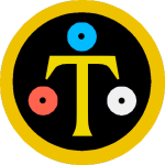
I took this one and I did 3 things:
  • Make the parts outside the ring transparent
  • A slightly brighter color on the T (#efd700) to make it stand out a bit more
  • In the "real favicon generator"-page, tweak the settings for "Add margins and a plain background." to get a tiny "dark ring" around the yellow ring
The result is:
1704296526932.png

It seems to make the outer ring and T "pop" a bit more :)


I've noticed that some of you guys' preview images look much nicer/sharper than mine, and I suspect it has something to do with your screens having a higher DPI setting (Mac perhaps?)... When I make the screenshots they are slightly less good quality :D (Your attachments are 1600px, and mine are 1125px)
 
Last edited:
A dark circle/background around the ring might make it "pop" a bit more due to a larger contrast between yellow & dark (compared to yellow & white which are closer to each other)

If not adding a dark background, I would suggest a transparent background (instead of white) so that the dark theme/incognito one looks a bit better :)

You can try to make the TTF characters a bit darker, but I'm also thinking it might help to make them a bit smaller, or at least get the roofs/tops of the letters moved a bit further away from the edge of the ring, so when shrunk down it doesn't "melt the ring outline and letters together" (bottom of letters looks okay) :)

Another thing that might help for the letter visibility is to make them a bit more bold. 🤔
Thanks for the feedback, I'll play around with it later today.
 
I took this one and I did 3 things:
  • Make the parts outside the ring transparent
  • A slightly brighter color on the T (#efd700) to make it stand out a bit more
  • In the "real favicon generator"-page, tweak the settings for "Add margins and a plain background." to get a tiny "dark ring" around the yellow ring
The result is:
View attachment 28662
It seems to make the outer ring and T "pop" a bit more :)


I've noticed that some of you guys' preview images look much nicer/sharper than mine, and I suspect it has something to do with your screens having a higher DPI setting (Mac perhaps?)... When I make the screenshots they are slightly less good quality :D (Your attachments are 1600px, and mine are 1125px)
And one more thing I tried, since my previous changes seemed to make the 3 rings a bit invisible: make the holes in them smaller :D
1704297255256.png

Although, then, the full sized image looks a bit clumsy :D
three_rings_icon_darkv2_massacred.png
 
They don't look like rings now though.
umnhhh... the silmarils weren't 'rings' ?? Just gems.

When I first saw it I thought they were representing the 3 elven rings.

Maybe they could be replaced with three nifty-looking bright gems of some kind showing up nicely? I dunno.
 

Similar threads

Back
Top